In advertising, it’s common to focus on the message. Marketers test different headlines, offers, and calls to action, expecting that better wording will lead to better results.
However, in practice, something unexpected often happens. The copy remains the same, the offer doesn’t change, yet performance shifts significantly after adjusting color or typography. This isn’t accidental — it reflects how users actually process content in social media feeds.
How Users Perceive Ads
Before users read anything, they react visually. In a fast-moving feed, attention is captured in a fraction of a second. The brain first processes shapes, colors, and contrast, and only then decides whether the content is worth reading.
If a creative doesn’t stand out visually, the message is rarely seen. Even strong copy won’t perform if it never gets noticed.
👉 Key idea: design determines whether your message gets a chance.
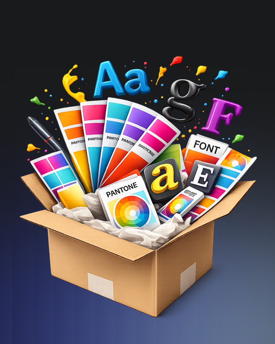
The Role of Color
Color plays a critical role in forming the first impression. It sets the emotional tone instantly and influences how the ad is perceived before any text is read.
Warm tones often feel energetic and action-driven, while cooler tones are typically associated with stability, trust, or technology. But beyond emotional associations, the most important factor is contrast. When colors blend together or lack clarity, the message becomes invisible in the feed.
Strong contrast, on the other hand, makes the creative easier to notice and faster to process.
👉 Key insight: visibility matters more than the color choice itself.
Typography as Communication
Typography is not just about style — it directly affects how information is understood. The same headline can create completely different impressions depending on the typeface.
A clean and minimal font can signal professionalism or a tech-focused brand, while a more refined style can suggest a premium offering. On the other hand, overly decorative or hard-to-read fonts increase cognitive load, making users spend more effort just to understand the message.
In a fast feed environment, that extra effort usually leads to disengagement.
👉 Key insight: clarity always outperforms complexity.
What Testing Reveals
The impact of design becomes especially clear in A/B tests. When creatives are simplified — using clear contrast, a focused color scheme, and readable typography — engagement often increases.
What makes this particularly interesting is that these improvements happen even when the copy remains unchanged. This shows that performance is not driven by message alone, but by how easily that message can be perceived.
👉 Conclusion: visual clarity directly influences results.
Why Design Drives Behavior
User behavior in social media is shaped by speed. People don’t analyze ads in detail — they scan and react. The decision to engage happens almost instantly, based on visual structure.
If the design is clear and structured, the ad is noticed and the message is processed. If it isn’t, the content is skipped without a second thought.
👉 Key insight: design is part of the message, not decoration.
Conclusion
Color and typography are essential elements of ad performance. They determine whether your content is seen, understood, and acted upon.
Strong copy matters, but it only works when supported by clear visual structure. In many cases, improving design is the fastest way to improve results.
💬 Have you seen changes in performance after adjusting color or typography?